Carries Top 10 Favourite Paint Colours Right Now: The Perfect Colours for Every Space
When it comes to transforming the ambiance of your home, few things hold the power like a fresh coat of paint. Paint colours can set the tone, evoke emotions, and elevate your space to new heights of sophistication and comfort. In this blog, we'll explore my current set of favourite colours and I’ll tell you little bit about why each one is a showstopper. Each colour has been carefully selected for its unique charm and versatility. Finding the right paint colour can be hard as there is so much to consider; a world of hues, different undertones and the colour changing effects of natural light. In this blog I will guide you in the right direction with a few of my favourites. So let jump in and explore the different shades and colours I love for every part of your home.
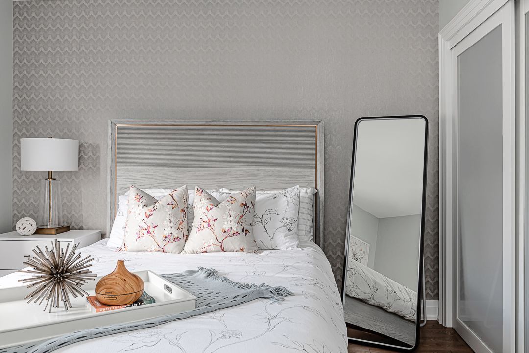
1. Sherwin Williams Silverpointe:
Silverpointe is a soft and serene soft blue, with cool undertones that provides the perfect calming ambiance. This gentle hue is an amazing choice for creating a tranquil and elegant backdrop in any room. Its versatility allows it to be used as a neutral backdrop in so many spaces in your house, from bedrooms to family rooms and even hallways. Silverpointe pairs beautifully with pastel shades and earthy tones, making it an ideal foundation for both contemporary and traditional interiors.
2. Sherwin Williams Egret White:
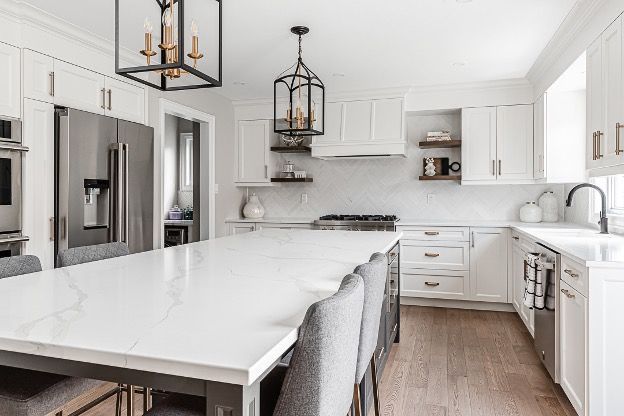
A warm and creamy white, Egret White radiates a sense of comfort and coziness. It's perfect for achieving a classic, timeless look in traditional interiors, but it can also blend well with modern decor. This versatile shade works wonderfully in bedrooms, bathrooms, and living rooms, creating an inviting and relaxed atmosphere. I look to this colour when creating a fresh front entry or open concept kitchen and living space.
3. Benjamin Moore Baby Fawn:
Baby Fawn is a warm beige with understated undertones, making it an excellent neutral option that doesn't feel flat or boring, a truly classic and versatile neutral option. This elegant hue effortlessly complements various colour palettes and design styles, making it a staple choice for any room in your home. Its subtle sophistication creates a classic look that stands the test of time. This is my go-to neutral when I am trying to refresh a space and add the perfect warm inviting feeling.
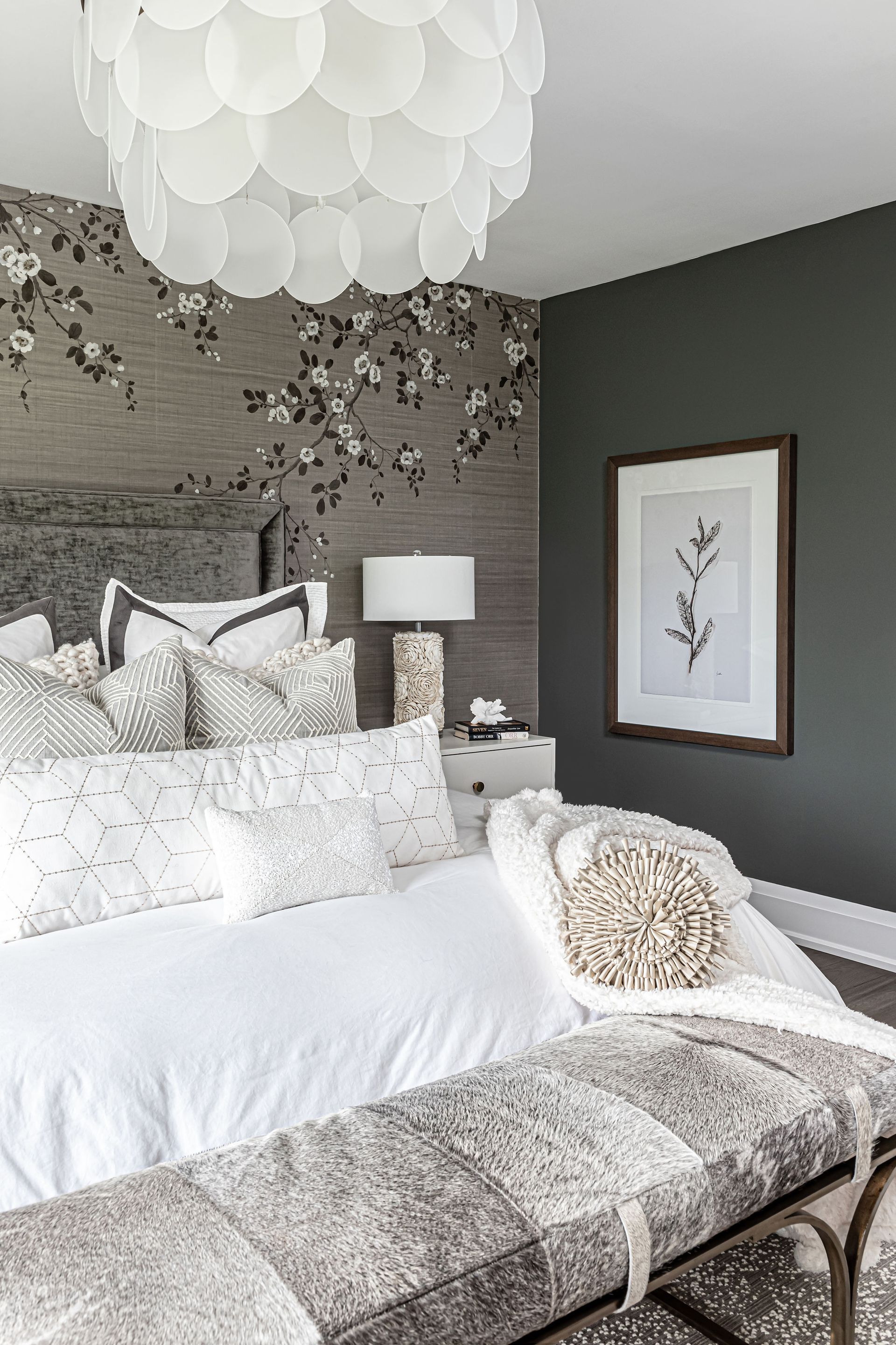
4. Sherwin Williams Night Owl:
For those who crave a touch of drama and luxury, Night Owl is just the choice for you. This deep and delicate neutral blends green and charcoal gray with a touch of cyan, it adds depth and character to your interiors, creating a sophisticated and opulent atmosphere. Night Owl shines when used on accent walls, cabinetry, or even as a backdrop in a study or library. Night Owl provides a timeless and sophisticated feel, especially when paired with brass or gold accents in hardware, fixtures or décor pieces.
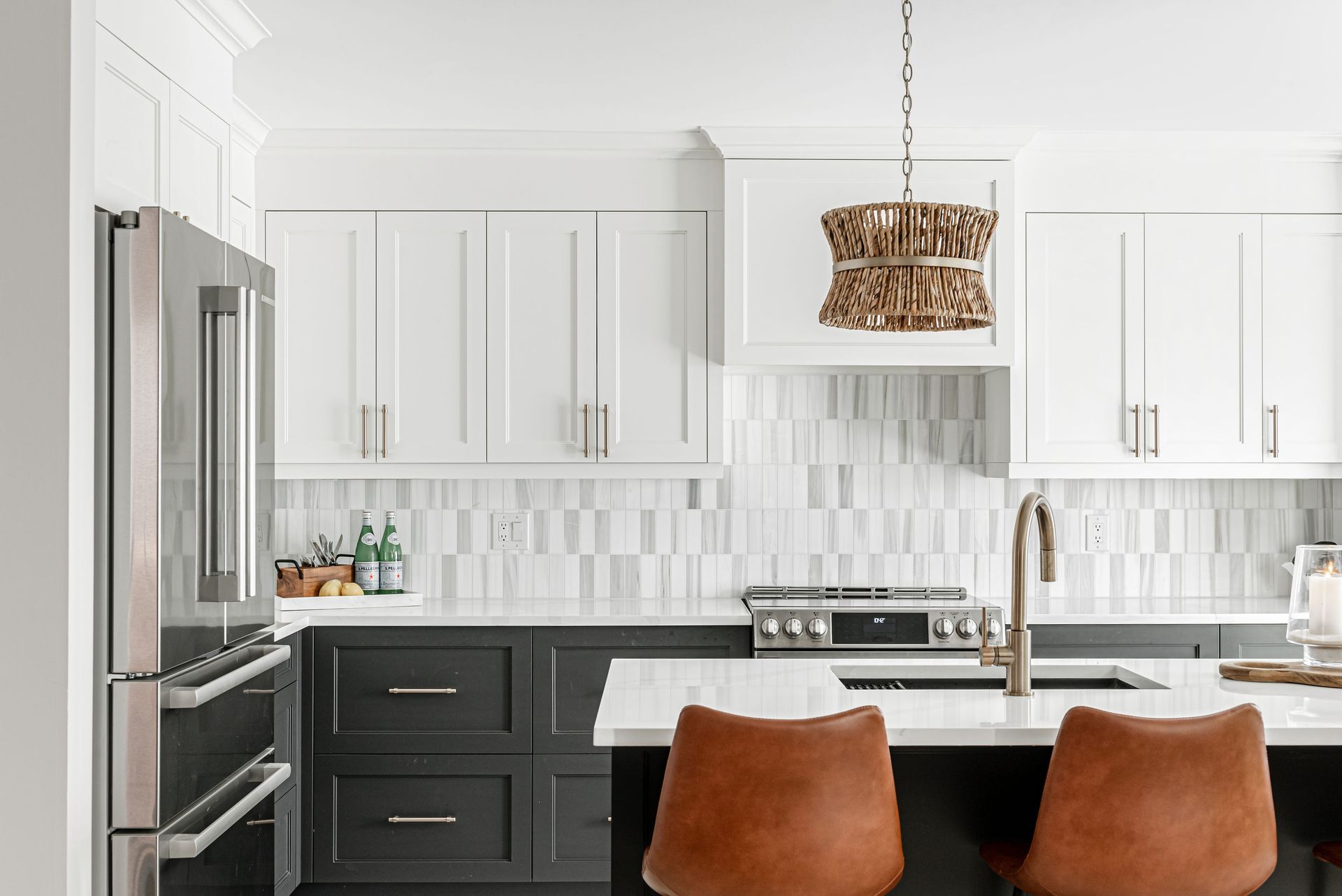
5. Sherwin Williams Iron Ore:
If you're looking to add a touch of modernity and depth to your space, Iron Ore is a fantastic option. This deep charcoal gray works well in contemporary settings, creating a sleek and elegant atmosphere. It's particularly striking when used for interior doors, trim, or as an accent wall in living rooms or dining areas. This colour is one of my favorites because it provides a bold statement that gives an effortless feel when just the right amount is incorporated.
6. Sherwin Williams Urban Bronze:
Urban Bronze, a warm brown with grey undertones, offers a versatile colour palette that complements various decor styles. This colour was voted colour of the year in 2021 and is rooted in nature with supreme down-to-earth stillness. It pairs beautifully with warm neutrals, rich textures, and metallic accents. Consider using it for an accent wall or in a study to create an intimate and inviting space.
Source: reviving_no37
7. Farrow and Ball Skimming Stone:
Skimming Stone, a warm neutral beige with a hint of gray, provides a timeless and elegant backdrop for your home. It begs its name from the colour of 19th century plaster used to skim walls. It works wonders in living rooms, dining areas, and bedrooms, lending sophistication to any decor style. Pair it with bold colors or rich textures for an exquisite contrast. Although Farrow & Ball paint can be a slight investment in terms of price point, you truly cannot beat the depth of hues in their colours. This is my go-to when creating a perfectly soothing space.
8. Sherwin Williams Gossamer Veil:
Gossamer Veil is a soft and light gray with warm undertones, it is the ideal colour to create a gentle and inviting ambiance. This neutral is such a versatile hue which is why it is one of my personal favourites. It is a colour I reach for when creating a neutral backdrop in bedrooms, bathrooms, or living spaces to infuse a sense of warmth and relaxation.
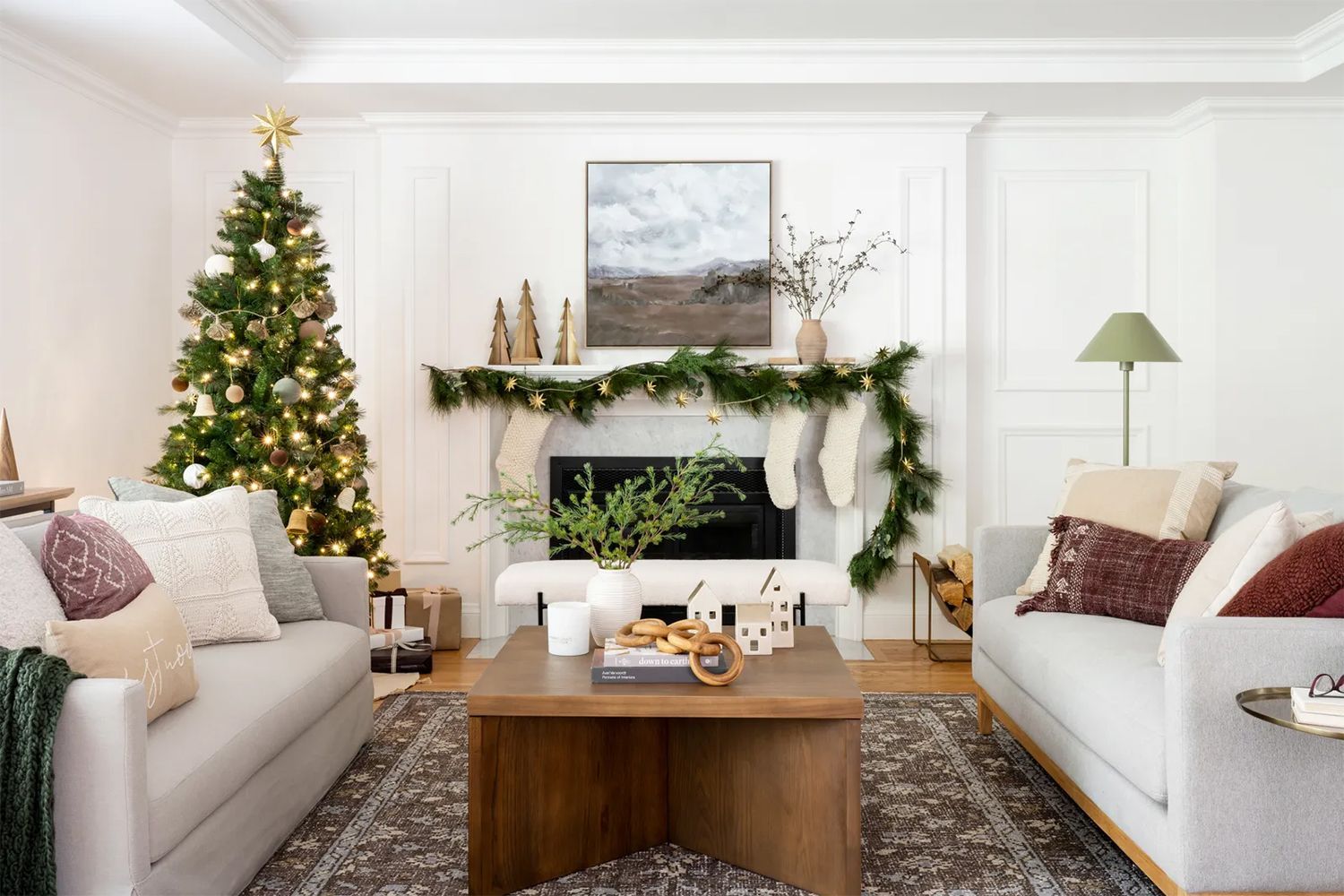
9. Benjamin Moore Porch Swing:
Porch Swing, a delightful pale green with subtle gray undertones, brings the essence of nature indoors. This refreshing colour choice can instantly transport you to a peaceful garden retreat. It works wonders in spaces such as bedrooms, kitchens, or sunrooms, where a touch of nature's tranquility is desired. It is an ideal grounding colour with its nods to nature and cozy feeling of sipping lemonade on your front porch on a lazy summer day.
Source: Remodelista
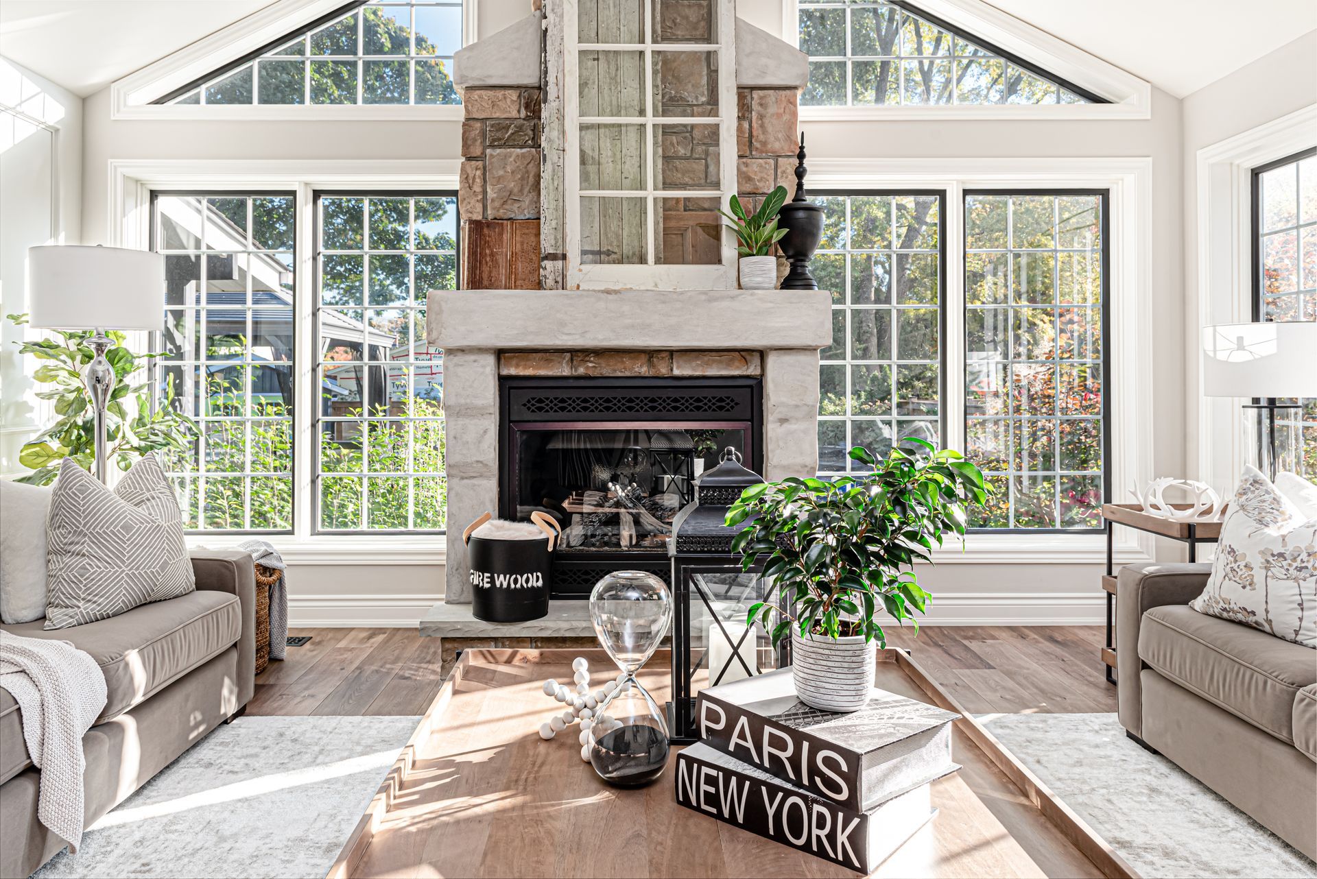
10. Benjamin Moore Flint:
Flint, a medium gray with subtle blue undertones, brings a sense of serenity and calmness to your interiors. If you are looking for a unique alternative to your basic neutral, flint is perfect for you. It pairs beautifully with light blues, greens, and cool tones, making it an excellent choice for bedrooms or bathrooms where tranquility is the key. I adore using this colour for a vanity or shiplap accent wall in a bathroom for its spa like feel.
Selecting the right paint colours can transform your home into a haven of style and comfort. I hope you enjoyed this walk though of my top 10 favourite colours right now. Each of the ten captivating hues in this collection offer a wide range of options, from calming neutrals to bold and opulent shades. Whether you're aiming for a classic look, contemporary vibes, or grounding space with natural tones, these paint colors will bring your vision to life. Embrace the power of a fresh coat of paint and marvel in the result of filling your space with a hue that is just right. If you are thinking of renovating and re-painting spaces in your home and need help curating the perfect décor style and colour palette, reach out, at CMH Interiors we are always happy to help.